Optical mixing of colours
The Amsterdam Standard Series offers you the broadest range of remarkably vibrant acrylic colors – all skillfully made based on a 100% acrylic emulsion and high-grade pigments. Enjoy great lightfastness and a choice of opacities. This medium viscosity paint is easy to work with and offers a smooth color when applied on its own. In combination with our various painting mediums, the paint becomes extremely versatile
The world around us is an ever-changing spectacle of colours. To capture this in a painting, knowledge of colour theory is indispensable
The following topics are explained in the book ‘Colour!’ by Royal Talens: the creation of colour, the properties of colour, mixing colours and painting with colour.
Using examples and explanations of various techniques, the possibilities for achieving the desired result are discussed.
Below is an example of optical colour mixing. This technique can be found on page 21 of the ‘Colour!’ booklet.
Head outdoors and take a photo of an environment with plenty of depth, or go with an existing photograph. Then choose the section you would like to use for your work.
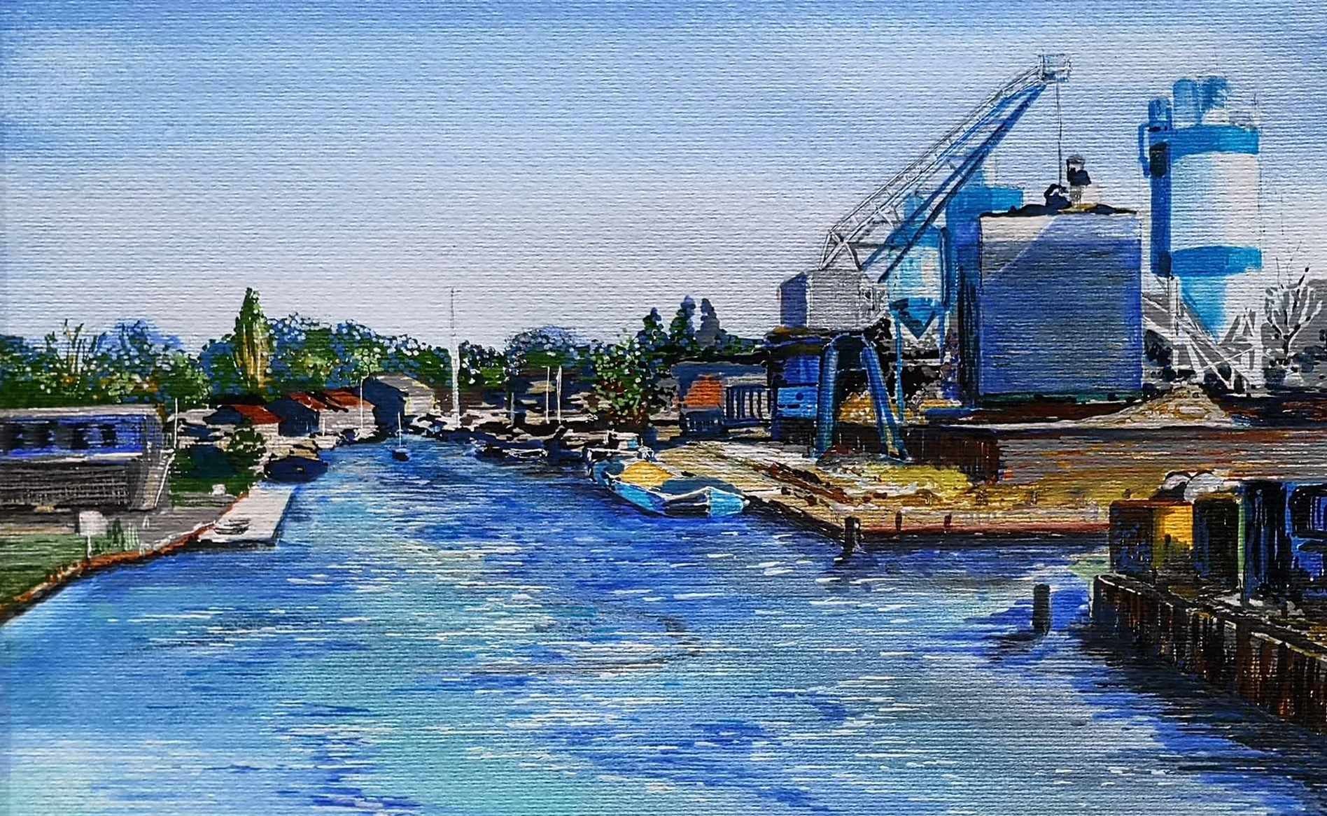
Materials used
- Rembrandt acrylic paper
- Amsterdam brushes: a fine brush and a medium-sized gussow brush
- Amsterdam Standard Series: Zinc White 104, Titanium White 105, Ultramarine 504 and Sap Green 623
- Amsterdam acrylic markers (Medium): Ultramarine 504, Primary Cyan 572, Phthalo Blue 570, Burnt Sienna 411, Burnt Umber 409, Neutral Grey 710, Permanent Green 618, Yellowish Green 617, Primary Yellow 275, Yellow Ochre 227, Azo Yellow Deep 270, Oxide Black 735
- Amsterdam acrylic markers (Small): Titanium White (105)
- Van Gogh sketch pencils (preferred hardness)
- Bruynzeel Design kneadable eraser
Step 1
Sketch with pencil on acrylic paper. Not everything on the photo needs to be included in the sketch. In this photo there was a large tree precisely in the centre of the selected area. This would have drawn considerable attention and was therefore omitted from the sketch. Also ensure that you don’t depict too many distracting details along the edge of your work. This will focus attention on your selected subject.

Step 2
Begin by painting the first layer for the sky with acrylic colours (105 & 504) and a coarse brush.
Please note! The sky is always lighter just above the horizon than further up. Paint this on with broad strokes. Continue with the rough base painting of the buildings and shapes. Use a brush for the larger areas and a marker for the fine elements

Step 3
Apply more details in black and blue. Observe the spatial effect. The greater the colour contrast, the closer the objects appear. In this work, therefore, the shadows of the houses are first made black and then blue. This makes the houses appear further away than if you were to make the shadows black. By layering the two colours, you achieve a deeper blue. (‘Colour!’ – “Saturation and suggesting space”, p. 27)

Step 4
Now fill in the tree line with marker. First, the dark shape, then lighter points in white, orange and yellow for the spatial effect. Initially the trees are too close. This can be remedied with blue dots at the top of the trees. (Colour! – “Optical mixing of colours”, p. 21).
TIP: For optical colour mixing, wait until the bottom layer is dry, as the paint will otherwise mix when wet.

Step 5
Continue to add more details. Try to work with many intersecting dots and lines to create an optical mix of colours. Be sure that the shadows and the perspective are still correct. Use the thin marker to add (small) white details.

Step 6
Lastly, finish working on the water. Paint the white areas turquoise (with a brush). Create the white and dark reflections of light on the water with a marker. Blending both white and blue achieves an optical mix of colours. (Colour! – “Optical mixing of colours”, p. 21).
Tip: you can mix the colours of the markers as long as the paint is still wet by overlapping the strokes. You can also draw a line with the marker and use a brush to blend and smooth it out (see the white silo on the right).